This charts and graphs template provides you with 10 different types of charts and graphs used in financial planning and analysis.
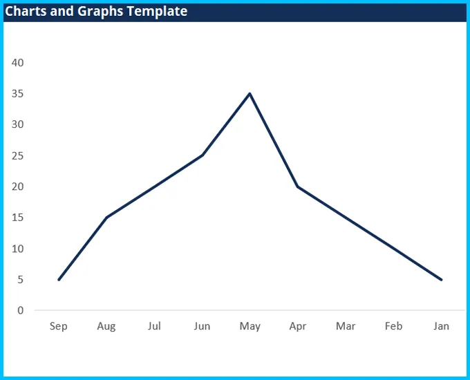
The perfect solution for showing multiple series of closely related series of data.
Bars (columns) are the best types of graphs for presenting a single data series.
This is very useful when presenting two data services that have a very different scale and might be expressed in different units.
The scatterplot is excellent for showing the relationship between two data series and determining their correlation.
The waterfall chart is excellent for variance analysis and explaining how an “actual” result was different than a “budget” or how something has changed relative to an original data point.
A pie graph is effective for illustrating the percentage breakdown of a small number of data points.
Histograms show the distribution of a dataset.
The gauge chart is perfect for graphing a single data point and showing where that result fits on a scale from “bad” to “good.”
An area chart is a solid area and can be effective when showing stacked, cumulative data series.
A spider or radar graph is a very useful type of graph for showing qualitative data or the overall “score” or comparison of multiple series.
Credits to : Corporate Finance Institute
 Test Template John Doe 888
Leadership Slide Template for PowerPoint
Test Template John Doe 888
Leadership Slide Template for PowerPoint
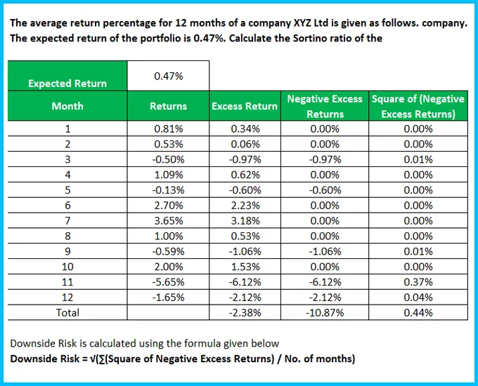
 Sortino Ratio Template
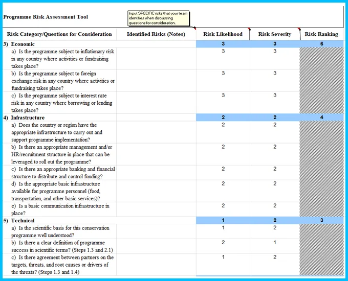
Risk Ranking and Mitigation
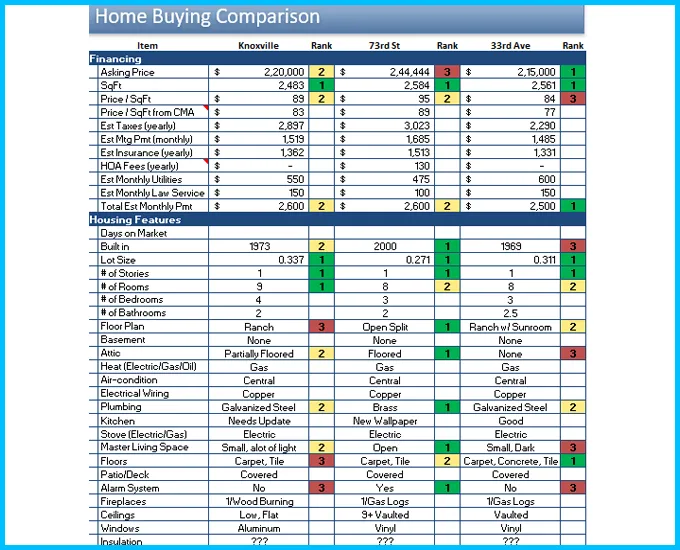
Home Buying Comparison Template
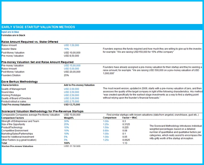
Early Stage Startup Valuation Methods
Commercial Real Estate Valuation Model
Checkbook Register Template
Sortino Ratio Template
Risk Ranking and Mitigation
Home Buying Comparison Template
Early Stage Startup Valuation Methods
Commercial Real Estate Valuation Model
Checkbook Register Template
 Project Management Agreement Template
Wedding photography contract Template
Non Disclosure Agreement Template
Event Budget Template
Cold Email Sales Weekly Activity Spreadsheet
Branding and Creative Budget Template
Blog Editorial Calendar - Google Calendar
Project Management Agreement Template
Wedding photography contract Template
Non Disclosure Agreement Template
Event Budget Template
Cold Email Sales Weekly Activity Spreadsheet
Branding and Creative Budget Template
Blog Editorial Calendar - Google Calendar

Find a pre-made digital template of any type and topic or ask a professional to create a custom one for you